找到
3
篇与
模板
相关的结果
-
-
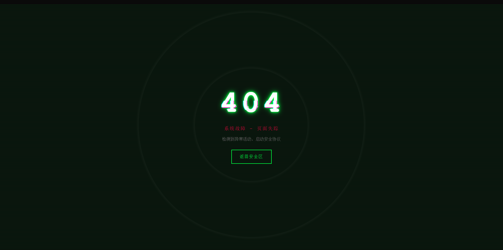
故障风格404页面 效果演示 点击查看在线演示 图片演示图片 完整代码 <!DOCTYPE html> <html lang="zh-CN"> <head> <meta charset="UTF-8"> <meta name="viewport" content="width=device-width, initial-scale=1.0"> <title>系统故障 - 404</title> <style> * { margin: 0; padding: 0; box-sizing: border-box; } body { background: #0a0a0a; font-family: 'Courier New', monospace; height: 100vh; overflow: hidden; display: flex; align-items: center; justify-content: center; color: #00ff41; cursor: crosshair; } .matrix-bg { position: absolute; width: 100%; height: 100%; opacity: 0.1; background: repeating-linear-gradient( 0deg, transparent, transparent 2px, #00ff41 2px, #00ff41 4px ); animation: scan 8s linear infinite; } @keyframes scan { 0% { transform: translateY(-100%); } 100% { transform: translateY(100%); } } .container { text-align: center; position: relative; z-index: 10; } .error-code { font-size: 120px; font-weight: bold; position: relative; display: inline-block; color: #fff; letter-spacing: 10px; animation: flicker 0.5s infinite alternate; } .error-code::before, .error-code::after { content: "404"; position: absolute; top: 0; left: 0; width: 100%; height: 100%; background: transparent; overflow: hidden; } .error-code::before { left: 2px; text-shadow: -2px 0 #ff00c8; animation: glitch-1 0.3s infinite ease-in-out alternate-reverse; clip: rect(44px, 450px, 56px, 0); } .error-code::after { left: -2px; text-shadow: -2px 0 #00ffff, 2px 2px #ff00c8; animation: glitch-2 0.3s infinite ease-in-out alternate-reverse; clip: rect(44px, 450px, 56px, 0); } @keyframes glitch-1 { 0% { clip: rect(31px, 9999px, 94px, 0); } 20% { clip: rect(112px, 9999px, 76px, 0); } 40% { clip: rect(85px, 9999px, 77px, 0); } 60% { clip: rect(62px, 9999px, 34px, 0); } 80% { clip: rect(97px, 9999px, 89px, 0); } 100% { clip: rect(53px, 9999px, 47px, 0); } } @keyframes glitch-2 { 0% { clip: rect(65px, 9999px, 119px, 0); } 20% { clip: rect(52px, 9999px, 74px, 0); } 40% { clip: rect(4px, 9999px, 78px, 0); } 60% { clip: rect(100px, 9999px, 19px, 0); } 80% { clip: rect(22px, 9999px, 98px, 0); } 100% { clip: rect(89px, 9999px, 113px, 0); } } @keyframes flicker { 0%, 19%, 21%, 23%, 25%, 54%, 56%, 100% { text-shadow: 0 0 5px #00ff41, 0 0 10px #00ff41, 0 0 20px #00ff41; } 20%, 22%, 24%, 55% { text-shadow: none; } } .error-message { font-size: 18px; color: #ff0040; margin: 20px 0; animation: pulse 2s infinite; text-transform: uppercase; letter-spacing: 3px; } @keyframes pulse { 0%, 100% { opacity: 1; } 50% { opacity: 0.3; } } .home-button { display: inline-block; padding: 15px 30px; margin-top: 30px; border: 2px solid #00ff41; background: transparent; color: #00ff41; text-decoration: none; text-transform: uppercase; letter-spacing: 2px; position: relative; overflow: hidden; transition: all 0.3s; font-family: 'Courier New', monospace; } .home-button:hover { color: #0a0a0a; box-shadow: 0 0 20px #00ff41; } .home-button::before { content: ''; position: absolute; top: 0; left: -100%; width: 100%; height: 100%; background: #00ff41; transition: left 0.3s; z-index: -1; } .home-button:hover::before { left: 0; } .noise { position: absolute; top: 0; left: 0; width: 100%; height: 100%; background: radial-gradient(circle, transparent 20%, rgba(255,255,255,0.03) 20.1%, transparent 21%), radial-gradient(circle, transparent 40%, rgba(255,255,255,0.03) 40.1%, transparent 41%); animation: noise 0.5s steps(10) infinite; pointer-events: none; } @keyframes noise { 0%, 100% { transform: translate(0); } 10% { transform: translate(-2px, -2px); } 20% { transform: translate(2px, 2px); } 30% { transform: translate(-2px, 2px); } 40% { transform: translate(2px, -2px); } 50% { transform: translate(-2px, -2px); } 60% { transform: translate(2px, 2px); } 70% { transform: translate(-2px, 2px); } 80% { transform: translate(2px, -2px); } 90% { transform: translate(-2px, -2px); } } .system-info { position: absolute; bottom: 20px; left: 20px; font-size: 12px; color: #666; font-family: monospace; animation: typewriter 3s steps(30) 1; } @keyframes typewriter { from { width: 0; } to { width: 100%; } } @media (max-width: 768px) { .error-code { font-size: 80px; } .error-message { font-size: 14px; } } </style> </head> <body> <div class="matrix-bg"></div> <div class="noise"></div> <div class="container"> <h1 class="error-code">404</h1> <p class="error-message">系统故障 - 页面失踪</p> <p style="color: #666; margin-top: 10px;">检测到异常活动,启动安全协议</p> <a href="https://www.khkj6.com" class="home-button">返回安全区</a> </div> <script> // 随机故障效果 setInterval(() => { document.body.style.filter = `hue-rotate(${Math.random() * 360}deg)`; setTimeout(() => { document.body.style.filter = 'none'; }, 100); }, 3000); // 鼠标追踪效果 document.addEventListener('mousemove', (e) => { const x = e.clientX / window.innerWidth; const y = e.clientY / window.innerHeight; const glitch = document.querySelector('.error-code'); glitch.style.transform = `translate(${x * 4}px, ${y * 4}px)`; }); </script> </body> </html>

-
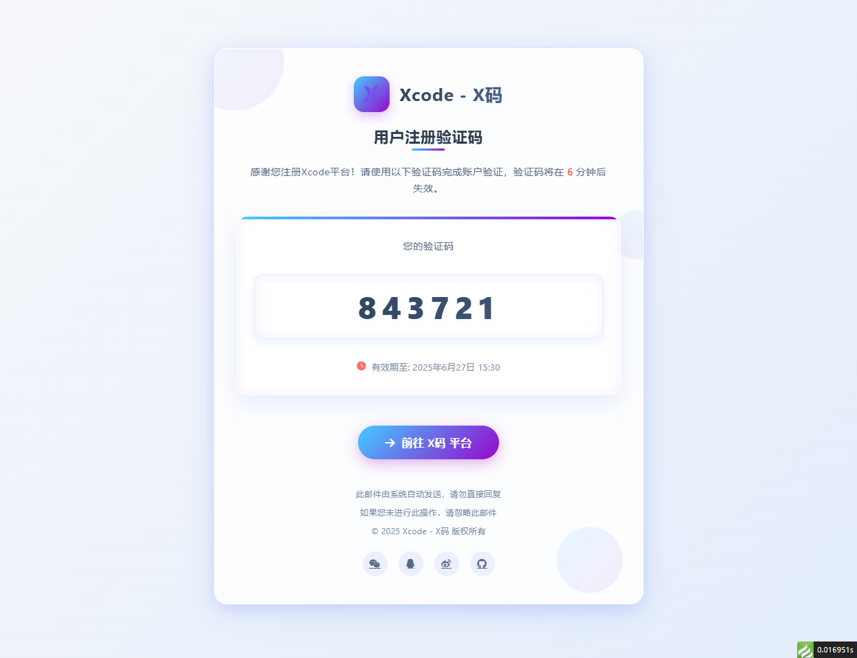
邮箱验证码html模板 适配大屏和小屏 问题:fa图标在邮件中不显示,请自行替换成图片 演示图片 大屏演示图片 代码 <!DOCTYPE html> <html lang="zh-CN"> <head> <meta charset="UTF-8"> <meta name="viewport" content="width=device-width, initial-scale=1.0"> <title>用户注册 - Xcode验证码</title> <link rel="stylesheet" href="https://cdnjs.cloudflare.com/ajax/libs/font-awesome/6.4.0/css/all.min.css"> <style> /* 基础样式重置 */ * { margin: 0; padding: 0; box-sizing: border-box; font-family: 'Segoe UI', 'PingFang SC', 'Microsoft YaHei', sans-serif; } body { background: linear-gradient(135deg, #f5f7fa 0%, #e4edfb 100%); min-height: 100vh; display: flex; justify-content: center; align-items: center; padding: 30px; letter-spacing: 0.5px; } /* 亮色毛玻璃效果容器 */ .glass-container { background: rgba(255, 255, 255, 0.85); backdrop-filter: blur(12px); -webkit-backdrop-filter: blur(12px); border-radius: 24px; border: 1px solid rgba(255, 255, 255, 0.8); box-shadow: 0 12px 40px rgba(98, 131, 252, 0.15), 0 4px 20px rgba(98, 131, 252, 0.08); width: 100%; max-width: 780px; overflow: hidden; padding: 50px 40px; position: relative; transition: all 0.4s ease; } .glass-container:hover { box-shadow: 0 15px 50px rgba(98, 131, 252, 0.2), 0 6px 25px rgba(98, 131, 252, 0.12); transform: translateY(-5px); } /* 装饰元素 */ .decoration { position: absolute; border-radius: 50%; background: linear-gradient(135deg, rgba(67, 203, 255, 0.15) 0%, rgba(151, 8, 204, 0.1) 100%); z-index: -1; opacity: 0.7; } .decoration-1 { width: 180px; height: 180px; top: -60px; left: -60px; animation: float 8s infinite ease-in-out; } .decoration-2 { width: 120px; height: 120px; bottom: 30px; right: 30px; animation: float 10s infinite ease-in-out; animation-delay: 1s; } .decoration-3 { width: 90px; height: 90px; top: 30%; right: -30px; animation: float 12s infinite ease-in-out; animation-delay: 2s; } @keyframes float { 0%, 100% { transform: translate(0, 0); } 25% { transform: translate(-10px, 15px); } 50% { transform: translate(5px, -10px); } 75% { transform: translate(10px, 5px); } } /* 头部样式 */ .header { text-align: center; margin-bottom: 40px; position: relative; } .logo { display: flex; justify-content: center; align-items: center; margin-bottom: 25px; } .logo-icon { width: 65px; height: 65px; background: linear-gradient(135deg, #43CBFF 0%, #9708CC 100%); border-radius: 18px; display: flex; justify-content: center; align-items: center; margin-right: 18px; box-shadow: 0 8px 20px rgba(151, 8, 204, 0.25); transition: all 0.3s ease; } .logo-icon:hover { transform: rotate(10deg) scale(1.05); } .logo-icon img { margin: 20%; width: 60%; height: 60%; filter: drop-shadow(0 2px 4px rgba(0, 0, 0, 0.1)); } .logo-text { font-size: 32px; font-weight: 700; background: linear-gradient(135deg, #2c3e50 0%, #4a6491 100%); -webkit-background-clip: text; background-clip: text; color: transparent; letter-spacing: 1.2px; } .title { font-size: 28px; font-weight: 700; color: #2c3e50; margin-bottom: 30px; position: relative; display: inline-block; } .title::after { content: ""; position: absolute; bottom: -8px; left: 50%; transform: translateX(-50%); width: 60px; height: 4px; background: linear-gradient(135deg, #43CBFF 0%, #9708CC 100%); border-radius: 2px; } .subtitle { font-size: 18px; color: #5a6a85; line-height: 1.7; margin: 0 auto; /* max-width: 600px; */ padding: 0 20px; } /* 验证码区域 - 亮色系突出 */ .verification-section { background: rgba(255, 255, 255, 0.95); border-radius: 20px; padding: 40px 30px; margin: 40px 0; text-align: center; backdrop-filter: blur(5px); -webkit-backdrop-filter: blur(5px); border: 1px solid rgba(255, 255, 255, 0.9); box-shadow: 0 10px 30px rgba(98, 131, 252, 0.1), inset 0 0 15px rgba(151, 8, 204, 0.05); position: relative; overflow: hidden; transition: all 0.3s ease; } .verification-section::before { content: ""; position: absolute; top: 0; left: 0; right: 0; height: 5px; background: linear-gradient(135deg, #43CBFF 0%, #9708CC 100%); } .verification-section:hover { transform: translateY(-5px); box-shadow: 0 15px 40px rgba(98, 131, 252, 0.15), inset 0 0 20px rgba(151, 8, 204, 0.08); } .verification-label { font-size: 18px; color: #5a6a85; margin-bottom: 20px; font-weight: 500; } .verification-code { width: 100%; font-size: 56px; font-weight: 800; letter-spacing: 10px; background: linear-gradient(135deg, #2c3e50 0%, #4a6491 100%); -webkit-background-clip: text; background-clip: text; color: transparent; padding: 20px 40px; border-radius: 16px; margin: 20px 0; display: inline-block; box-shadow: inset 0 0 25px rgba(98, 131, 252, 0.1), 0 8px 20px rgba(98, 131, 252, 0.1); border: 1px solid rgba(98, 131, 252, 0.15); text-shadow: 0 2px 4px rgba(0, 0, 0, 0.05); transition: all 0.3s ease; } .verification-code:hover { letter-spacing: 12px; box-shadow: inset 0 0 30px rgba(98, 131, 252, 0.15), 0 10px 25px rgba(98, 131, 252, 0.15); } .expiration { font-size: 16px; color: #7a8ca5; margin-top: 20px; display: flex; align-items: center; justify-content: center; gap: 10px; } .expiration i { color: #ff6b6b; } /* 操作区域 */ .action-section { text-align: center; margin-top: 50px; } .action-button { background: linear-gradient(135deg, #43CBFF 0%, #9708CC 100%); color: white; border: none; padding: 18px 50px; font-size: 20px; font-weight: 600; border-radius: 60px; cursor: pointer; transition: all 0.3s ease; box-shadow: 0 8px 25px rgba(151, 8, 204, 0.3); text-decoration: none; display: inline-flex; align-items: center; gap: 12px; position: relative; overflow: hidden; } .action-button::before { content: ""; position: absolute; top: 0; left: -100%; width: 100%; height: 100%; background: linear-gradient(90deg, transparent, rgba(255, 255, 255, 0.3), transparent); transition: 0.5s; } .action-button:hover::before { left: 100%; } .action-button:hover { transform: translateY(-5px) scale(1.05); box-shadow: 0 12px 35px rgba(151, 8, 204, 0.4); } .action-button:active { transform: translateY(0) scale(0.98); } .copyright-link { color: #7a8ca5; text-decoration: none; transition: all 0.3s ease; } .copyright-link:hover { color: #9708CC; text-decoration: underline; } /* 底部信息 */ .footer { text-align: center; margin-top: 50px; color: #7a8ca5; font-size: 15px; line-height: 1.7; } .footer p { margin-bottom: 8px; } .social-icons { display: flex; justify-content: center; gap: 20px; margin-top: 25px; } .social-icons a { width: 45px; height: 45px; border-radius: 50%; background: rgba(98, 131, 252, 0.1); display: flex; align-items: center; justify-content: center; color: #5a6a85; font-size: 18px; transition: all 0.3s ease; } .social-icons a:hover { background: linear-gradient(135deg, #43CBFF 0%, #9708CC 100%); color: white; transform: translateY(-5px); } /* 响应式设计 */ @media (max-width: 768px) { .glass-container { padding: 40px 30px; max-width: 100%; } .logo-icon { width: 55px; height: 55px; } .logo-text { font-size: 28px; } .title { font-size: 24px; } .subtitle { font-size: 16px; } .verification-section { padding: 30px 20px; } .verification-code { font-size: 42px; padding: 15px 30px; letter-spacing: 8px; } .action-button { padding: 16px 40px; font-size: 18px; } } @media (max-width: 480px) { .glass-container { padding: 30px 20px; } .logo { flex-direction: column; gap: 15px; } .logo-icon { margin-right: 0; } .logo-text { font-size: 26px; } .title { font-size: 22px; } .verification-section { padding: 25px 15px; } .verification-code { font-size: 36px; padding: 12px 20px; letter-spacing: 6px; } .action-button { padding: 14px 35px; font-size: 16px; } } </style> </head> <body> <div class="glass-container"> <!-- 装饰元素 --> <div class="decoration decoration-1"></div> <div class="decoration decoration-2"></div> <div class="decoration decoration-3"></div> <div class="header"> <div class="logo"> <div class="logo-icon"> <img src="http://xma.dev.khkj.xyz/static/images/logo.png" alt="Xcode Logo"> </div> <div class="logo-text">Xcode - X码</div> </div> <h1 class="title">用户注册验证码</h1> <p class="subtitle">感谢您注册Xcode平台!请使用以下验证码完成账户验证,验证码将在 <text style="color:red;">6</text> 分钟后失效。</p> </div> <div class="verification-section"> <div class="verification-label">您的验证码</div> <div class="verification-code">843721</div> <div class="expiration"> <i class="fas fa-clock"></i>有效期至: 2025年6月27日 15:30 </div> </div> <div class="action-section"> <a href="https://xma.run" class="action-button"> <i class="fas fa-arrow-right"></i>前往 X码 平台 </a> </div> <div class="footer"> <p>此邮件由系统自动发送,请勿直接回复</p> <p>如果您未进行此操作,请忽略此邮件</p> <p>© 2025 <a href="https://xma.run" class="copyright-link">Xcode - X码</a> 版权所有</p> <div class="social-icons"> <a href="#"><i class="fab fa-weixin"></i></a> <a href="#"><i class="fab fa-qq"></i></a> <a href="#"><i class="fab fa-weibo"></i></a> <a href="#"><i class="fab fa-github"></i></a> </div> </div> </div> <script> // 添加简单的交互效果 document.addEventListener('DOMContentLoaded', function() { const verificationCode = document.querySelector('.verification-code'); // 添加点击复制功能 verificationCode.addEventListener('click', function() { const text = this.innerText; const tempInput = document.createElement('input'); tempInput.value = text; document.body.appendChild(tempInput); tempInput.select(); document.execCommand('copy'); document.body.removeChild(tempInput); alert("复制成功"); }); }); </script> </body> </html>